Mobile-responsive UI
Both administrator and end user app are mobile-responsive and can be used without functional limitations on mobile devices. The mobile version user interface is mostly self-explanatory and follows common industry standards.
This topic compares the desktop and mobile version of the administrator app. A corresponding comparison for the end user app can be found in USU Shop - User Guide.
Please refer to the images below to see examples of the following mobile-responsive UI transformations:
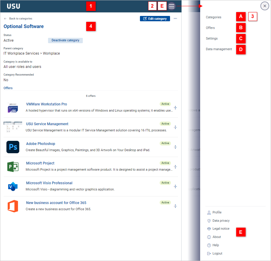
The desktop USU toolbar [1] transforms into a mobile toolbar containing a “hamburger menu”
 View example
The collapsible sidebar [2] functionality (switching between modes [A] [B] [C] [D]) is provided by the hamburger menu, as well as the user profile [E] originally found in the toolbar. View example
Either the overview tab [3] or the detail dab [4] is displayed in one screen. To switch to the overview tab (category tree, offer list), click the corresponding items in the hamburger menu. View example
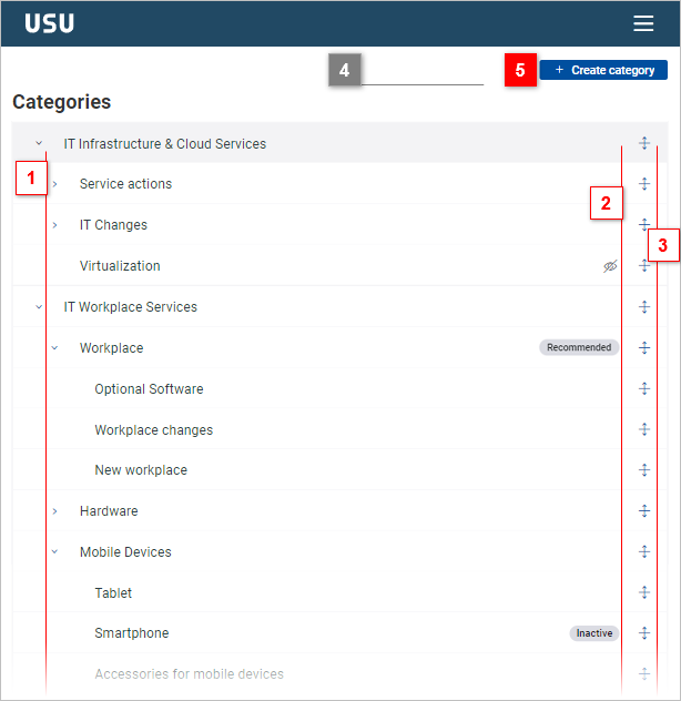
Some UI elements may be placed slightly differently (example: [5]) View example
Some UI elements may be left out of the mobile version interface due to space considerations (example: [4]) View example
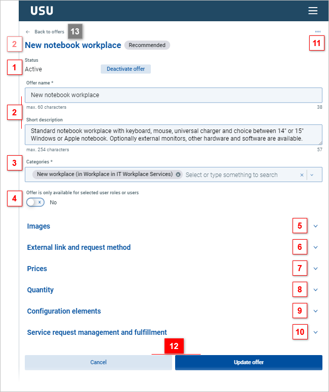
The detail tab in the mobile version contains a breadcrumb link (example: [13]) for backward page navigation. View example
The buttons at the top right from the detail tab of the desktop version can be found at the page bottom (example: [12]) in the mobile version. View example
Generally, navigation by vertical scrolling is accentuated in the mobile version.
Examples
Compare this mobile version user interface with the desktop version:
| directly visible |
| visible upon click |


Compare this mobile version overview tab with the desktop version:
| different |
| the same |
| desktop version only |

Compare this mobile version detail tab with the desktop version:
| different |
| the same |
| mobile version only |