Mobile-responsive user interface
The is fully mobile-responsive and can be used without functional limitations on mobile devices. The mobile version user interface is mostly self-explanatory and follows common industry standards.
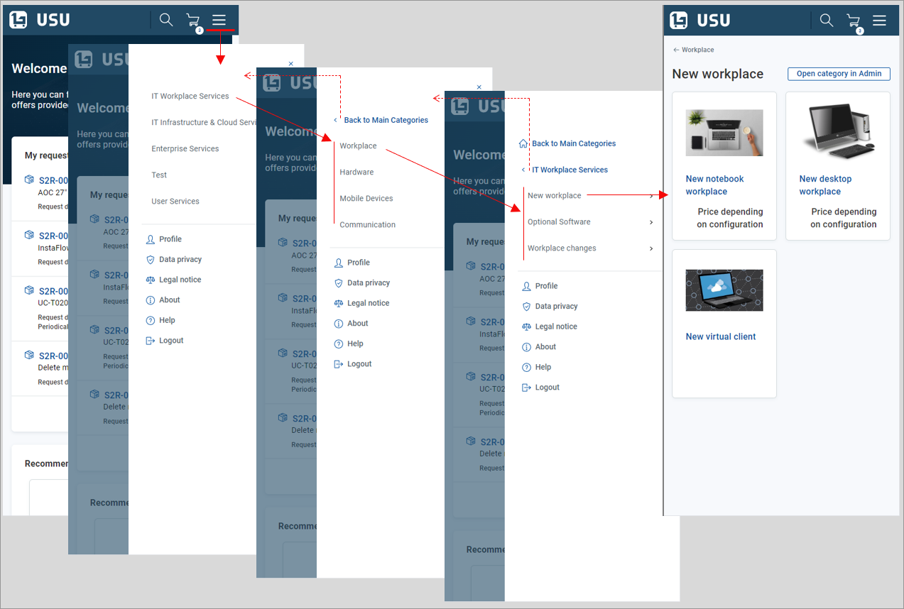
Navigation menu displays as a “Hamburger menu”
 in the top right-hand corner of the screen. View example
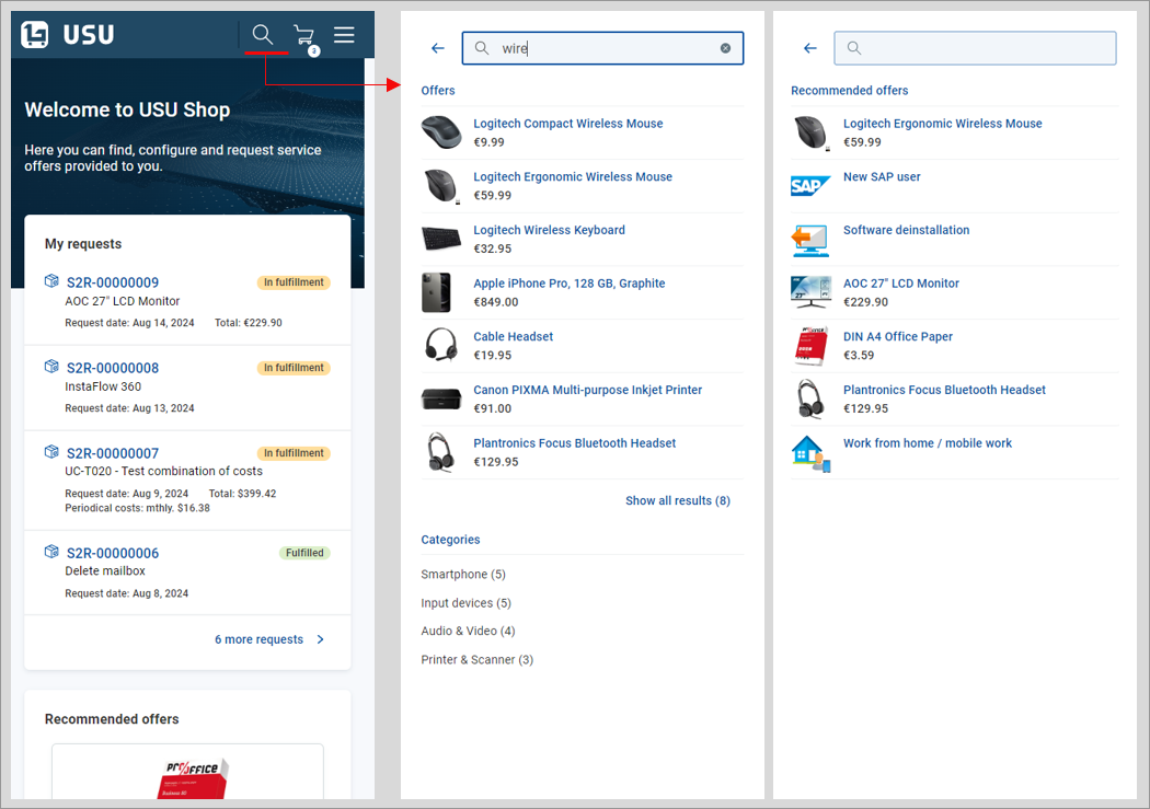
Search is started using the
 button at the top of the screen. The search page shows either search results or recommended offers (if no relevant search results results are available). View example
Note that the Welcome section search field (if enabled by customization) is not available in the mobile version GUI.
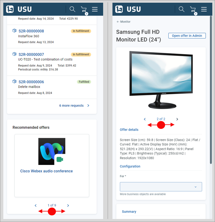
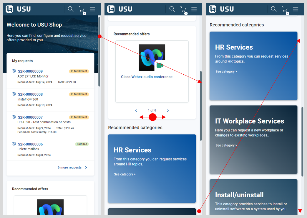
Swiping gestures can be used in graphical elements such as the widget or image carousels. View example
When a screen element is restricted horizontally, swipe to browse through its content. For instance, the widget in the homepage displays only one item at a time. Swipe to browse through all recommended offers. View example
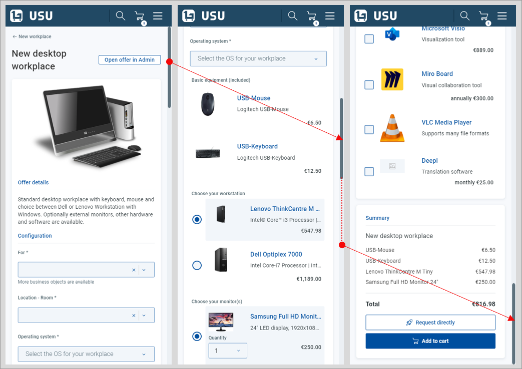
When a page is restricted horizontally, scroll vertically to browse through its content. For example:
- The section positioned on the right of the standard window can be reached by scrolling all the way down in the mobile version. View example
- can be browsed by scrolling vertically in the mobile version GUI. View example
Generally, drill-down technique is used to eliminate the number of elements on the screen. View example
Examples